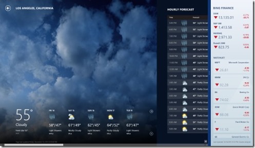
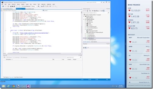
When a Windows Store application is run, by default it is displayed without any chrome (window border, menus, etc) and fills the entire screen. You an also display two applications at once by snapping one of them to one side of the screen or the other.

It’s interesting to note that one of the two applications can actually be the desktop.

In this post I will show how to implement the snapping feature in your own apps. I will use the Salesforce app that we have been developing in the last few posts to demonstrate this, but the techniques are applicable to any Windows 8 application.
Changing an application from full screen to snapped view is handled automatically by the Windows Runtime (and cannot be disabled) but unless you specifically setup your application to handle this, the same layout will be used for both the full screen and snapped view which usually won’t look very good. Fortunately the page templates that come with Visual Studio provide most of the code you need to handle this.
First lets look at AccountsView.xaml. The default itemsView page template has two content controls in it, a GridView and a ListView. The ListView is used when the application is snapped to the left or right side of the screen and the GridView is used at other times. Currently our application only has the GridView setup, so let’s start by setting up the ListView.
By default the ListView’s ItemTemplate uses the Standard80ItemTemplate, but this doesn’t reference the fields we have in the Account object so we need to create a new template. Here is a simple template that goes in the Page.Resource section.
<DataTemplate x:Key="StandardListItemTemplate">
    <StackPanel Margin="10,0,0,0">
        <TextBlock Text="{Binding Name}" Style="{StaticResource ItemTextStyle}" MaxHeight="40"/>
        <TextBlock Text="{Binding AccountNumber}" Style="{StaticResource CaptionTextStyle}" TextWrapping="NoWrap"/>
    </StackPanel>
</DataTemplate>
This template simply displays two TextBlocks in a StackPanel, one for the account Name and the other for the AccountNumber. Next we need to change the ListView to use this template.
ItemTemplate="{StaticResource StandardListItemTemplate}"
Now that we have defined two separate views of the data, the next thing we need to do is define which views are used when. This is also done in the XAML markup using a VisualStateManager. The VisualStateManager manages groups of control states where one state in each group can be active at a time. The code that actually triggers the state switching in the LayoutAwarePage.cs class, which we will look at in a minute, and this code expects the various visual states to be named the same as the states the application can be in. There are four possible states:
FullScreenLandscape: The application is filling the screen in landscape orientation.
FullScreenPortrait: The application is filling the screen in portrait orientation.
Filled: Another application is snapped and the current application is filling the rest of the screen.
Snapped: The application is snapped to either the left or right side of the screen.
There is also one more state which I will call the base state. This is the state of the controls as they are defined in the XAML markup before any other states have been applied.
Now let’s look at the markup:
<VisualStateManager.VisualStateGroups>
         <VisualStateGroup x:Name="ApplicationViewStates">
             <VisualState x:Name="FullScreenLandscape"/>
             <VisualState x:Name="Filled"/>
The first part declares the visual state manager, and a VisualStateGroup called ApplicationViewStates which will hold the various states our application can be in. Next we have the first two states, FullScreenLandscape and Filled. You will notice that both of these states are empty which means that when the application enters either of these states the base state will be used. The base state in the XAML displays the GridView which is appropriate for both of those states.
<VisualState x:Name="FullScreenPortrait">
    <Storyboard>
        <ObjectAnimationUsingKeyFrames Storyboard.TargetName="backButton" Storyboard.TargetProperty="Style">
            <DiscreteObjectKeyFrame KeyTime="0" Value="{StaticResource PortraitBackButtonStyle}"/>
        </ObjectAnimationUsingKeyFrames>
        <ObjectAnimationUsingKeyFrames Storyboard.TargetName="itemGridView" Storyboard.TargetProperty="Padding">
            <DiscreteObjectKeyFrame KeyTime="0" Value="96,136,86,56"/>
        </ObjectAnimationUsingKeyFrames>
    </Storyboard>
</VisualState>
The next section defines the view for FullScreenPortrait. In this case the state simply adjusts some spacing around the GridView and the backButton. To do this it uses a storyboard that describes which properties of the controls need to change and how they should transition. The first part uses an animation to change the Style property on the backButton to the PortraitBackButtonStyle defined in StandardStyles.xaml. Even though this is defined as an animation the KeyTime is zero so the change happens immediately. The second part performs a similar animation to change the gridView padding.
        <VisualState x:Name="Snapped">
            <Storyboard>
                <ObjectAnimationUsingKeyFrames Storyboard.TargetName="backButton" Storyboard.TargetProperty="Style">
                    <DiscreteObjectKeyFrame KeyTime="0" Value="{StaticResource SnappedBackButtonStyle}"/>
                </ObjectAnimationUsingKeyFrames>
                <ObjectAnimationUsingKeyFrames Storyboard.TargetName="pageTitle" Storyboard.TargetProperty="Style">
                    <DiscreteObjectKeyFrame KeyTime="0" Value="{StaticResource SnappedPageHeaderTextStyle}"/>
                </ObjectAnimationUsingKeyFrames>
                <ObjectAnimationUsingKeyFrames Storyboard.TargetName="itemListView" Storyboard.TargetProperty="Visibility">
                    <DiscreteObjectKeyFrame KeyTime="0" Value="Visible"/>
                </ObjectAnimationUsingKeyFrames>
                <ObjectAnimationUsingKeyFrames Storyboard.TargetName="itemGridView" Storyboard.TargetProperty="Visibility">
                    <DiscreteObjectKeyFrame KeyTime="0" Value="Collapsed"/>
                </ObjectAnimationUsingKeyFrames>
            </Storyboard>
        </VisualState>
    </VisualStateGroup>
</VisualStateManager.VisualStateGroups>
The final section of the VisualStateManager markup is for the Snapped state. For this state we change the appearance of the back button and page title. We also hide the gridview and show the listview by setting the Visibility property on both objects.
Now that we have a VisualStateManager that describes how the page looks in each state, the final piece of the puzzle is the code that triggers the change from one state to another. The code for doing this is provided as part of the LayoutAwarePage class.
Here is the key function from LayoutAwarePage.cs
public void InvalidateVisualState()
{
    if (this._layoutAwareControls != null)
    {
        string visualState = DetermineVisualState(ApplicationView.Value);
        foreach (var layoutAwareControl in this._layoutAwareControls)
        {
            VisualStateManager.GoToState(layoutAwareControl, visualState, false);
        }
    }
}
This function is called whenever the windows size changes. First it gets the current state of the page by calling ApplicationView.Value and passing this to the DetermineVisualState function. By default DetermineVisualState just does a ToString() on the value, but I assume there are cases where you would override this default implementation. Once it has the state it iterates through a collection of controls, which by default only contains the current page, and calls the GoToState function passing in the control and the name of the state we want to put the control into. The name corresponds to the name property in VisualState elements of the VisualStateManager markup.
Now we have everything needed for our application to respond to state changes. I have shown a lot of code where but the majority of it is included in the Visual Studio templates to that actual work to implement this is pretty minimal.

